Looking Back
25-07-2016 Filed in: Zen BWV
Last week showed very little progress because of family engagements eating away at development time. So I thought I’d take this moment to look back a little at how this project came into existence in the first place.
Last week showed very little progress because of family engagements eating away at development time. So I thought I’d take this moment to look back a little at how this project came into existence in the first place.
From my Ludum Dare entries I learned that I like creating action/arcady kind of games: games with little narrative (I’m bad at narrative), simple mechanics (move! shoot!) and simple graphics (good guy, bad guys, bullets). Although I prefer to play narrative heavy games and strategy games myself, I know creating something like that on my own in my spare time is not feasible. And from Ludum Dare I learned that it’s better to have one finished project than 10 work-in-progress ones.
I also knew I wanted to give developing a game for a mobile platform a go, preferable something that can be played in portrait orientation. This gave me the following constraints:
The vertical scrolling shoot-em-up genre (or SHMUP) fits nicely with these constraints. Plus, they are fun to play. And I really wanted to do bullet patterns.
For the theme, I knew I wanted to use space. Mainly to avoid the need need for realistic graphics. I wanted to be able to use simple environment as space is mostly empty. It also made sound design a little simpler because I think you can get away with 8-bit style sounds better in a arcady space setting than in a very realistic environment. Added advantage: the Unity Asset Store has many very high quality space themed assets. I started with free assets, but later moved towards paid space ships and skyboxes.
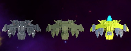
I also knew I wanted to use a flat shaded look. Therefore I first tried Polyworld Woodland, but couldn’t achieve the look I wanted. Later, I went for changing the models materials to use two materials: a colored matte material and a metallic black material. Here you can see the results of the process:
first the original model, then the Polyworld version and finally the two material version:

Note: I really love the PolyWorld shaders. The reason I didn’t like the results in this case is that it takes the colors of the original as the basis. And the space ships I bought were mostly black. The result is a converted mesh with dark colors baked in. This made it very difficult to see the space ships on the dark space background.
From here on I mainly just started coding and creating stuff. No real plan or clear idea yet. I guess actual design will be the next step.
I am considering creating a build of this project for WebGL deployment so you can give the game a try for yourselves. I’m holding off a bit though, because changing to and from iOS as deployment target takes ages.
Next time, I’ll talk a bit more about the actual game development.
From my Ludum Dare entries I learned that I like creating action/arcady kind of games: games with little narrative (I’m bad at narrative), simple mechanics (move! shoot!) and simple graphics (good guy, bad guys, bullets). Although I prefer to play narrative heavy games and strategy games myself, I know creating something like that on my own in my spare time is not feasible. And from Ludum Dare I learned that it’s better to have one finished project than 10 work-in-progress ones.
I also knew I wanted to give developing a game for a mobile platform a go, preferable something that can be played in portrait orientation. This gave me the following constraints:
- Action/Arcade game;
- Feasible to complete by me;
- Playable on mobile;
- Portrait screen orientation.
The vertical scrolling shoot-em-up genre (or SHMUP) fits nicely with these constraints. Plus, they are fun to play. And I really wanted to do bullet patterns.
For the theme, I knew I wanted to use space. Mainly to avoid the need need for realistic graphics. I wanted to be able to use simple environment as space is mostly empty. It also made sound design a little simpler because I think you can get away with 8-bit style sounds better in a arcady space setting than in a very realistic environment. Added advantage: the Unity Asset Store has many very high quality space themed assets. I started with free assets, but later moved towards paid space ships and skyboxes.
I also knew I wanted to use a flat shaded look. Therefore I first tried Polyworld Woodland, but couldn’t achieve the look I wanted. Later, I went for changing the models materials to use two materials: a colored matte material and a metallic black material. Here you can see the results of the process:
first the original model, then the Polyworld version and finally the two material version:

Note: I really love the PolyWorld shaders. The reason I didn’t like the results in this case is that it takes the colors of the original as the basis. And the space ships I bought were mostly black. The result is a converted mesh with dark colors baked in. This made it very difficult to see the space ships on the dark space background.
From here on I mainly just started coding and creating stuff. No real plan or clear idea yet. I guess actual design will be the next step.
I am considering creating a build of this project for WebGL deployment so you can give the game a try for yourselves. I’m holding off a bit though, because changing to and from iOS as deployment target takes ages.
Next time, I’ll talk a bit more about the actual game development.